


From reading most establishment press news, especially their economy-related reports, you'd think that those who are complaining about the current U.S. economy are outliers — especially the millions of Americans who are angry about it. Though they sometimes acknowledge that forward progress since the recession hasn't been robust, the media's meme-makers have mostly told us that "overall job gains have remained solid," and that we have a "resilient U.S. economy" despite woes seen in the rest of the world.
So imagine my surprise when I stumbled upon a Wednesday afternoon item by Heather Long and Patrick Gillpesie at CNN Money which told readers that those who "believe the middle class is dying, trade is killing U.S. jobs and that their kids won't have a chance to get ahead ... (have) some rationale behind their claims."
To make it clear how entrenched the establishment memes are, on March 1, Christopher Rugaber at the Associated Press mounted a defense of the status quo ("AP SURVEY: VOTER ANXIETY AT ODDS WITH ECONOMISTS' OPTIMISM"), telling readers for the umpteenth time in the past seven years that they need to be more patient, and that all-knowing, all-seeing economists say that prosperity is just around the corner. Specifically:
... while many people haven't benefited much since the recession ended, a stronger economy lies ahead.
It hasn't happened for seven years, Chris. Why should we believe them now?
The CNN Money pair made three strong and necessary arguments, but watered them down by focusing on the past three to six decades instead of honing in on the horrors of the past 7-9 years. Their final argument is not at all convincing, because the underlying data they referenced is hopelessly flawed.
Here are the arguments:
1. American families earn about the same as in 1995.
"About the same" really means "just above 1996, and below 1997."
I can't explain why the pair chose 1995, but I can criticize their presentation and their data.
The reference to 20 years ago cleverly avoids telling us how steep the recent declines have been since the Democratic Party took over Congress in 2007 (the damage that commenced did not begin to occur in earnest until October 2007, the beginning of the first full fiscal year under Democratic congressional control).
Here is the graph they presented, with the real 2007 value from the Census Bureau's 2014 income and poverty report added by me:

(Readers who look closely will realize that the value I have provided doesn't correspond to the value seen on the graph by a few hundred dollars. I can't explain where the CNN Money pair got their pre-2014 values, but I know that the table seen here represents the most recent available data.)
The CNN pair's description of the graph's contents — "It dipped a bit after September 11 and the dotcom bubble burst, but then it fell harder" — is Democrat-defending deception. Media household income recovered to within less than 1 percent of its 1999 peak in 2007. It "fell harder" only after Democrats took over Congress and began affecting the nation's spending priorities, and was still about 6.5 percent below that 2007 near-peak after six years of "recovery" during the Obama administration.
2. Life is tough for adults without college degrees.
Long's and Gillpesie's points were fine as far as they went, but I'd like to see someone look at the situation for adults without college degrees who attended a year or two of college, couldn't stay in school, and are sitting on huge student loans they can't hope to repay with with jobs they (might) have. (Yes, this is a problem for college grads too, but "at least" they have a degree, and "should" have an advantage in the workforce.)
I suspect that the life problems of those who borrowed a lot and have nothing to show for it are more serious than for those who never enrolled in college — and we've seen a serious overemphasis on college as a necessity during the Obama administration. As a result of this and cost increases which have continued unabated, outstanding student loan balances have doubled in the past seven years.
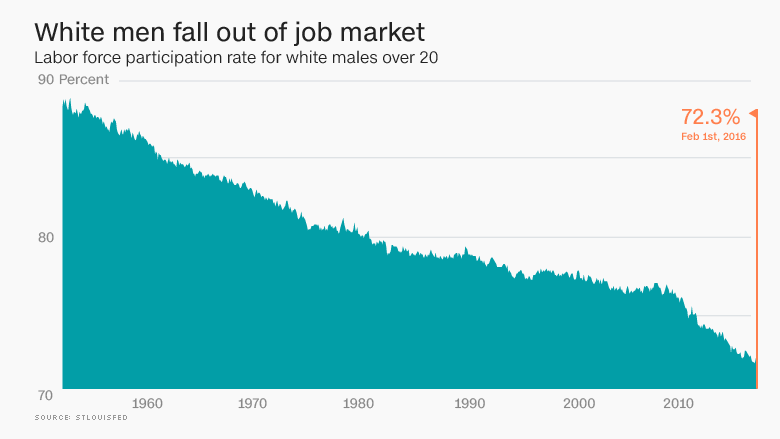
3. White men's footprint in the job market is shrinking.
Again, the CNN Money writers treated the problem as decades in the making, when it's really a trend that seriously accelerated in 2007. Though they failed to comment on the phenomenon, the graph they employed clearly demonstrates that grim reality.
 Specifically, looking at seasonally adjusted annual February values, the decline in the white male labor force participation rate from 1975 to 2007 was 4.0 percentage points (from 80.7 percent to 76.7 percent). The decline since 2007 has been 4.4 percentage points (from 76.7 percent to the 72.3 percent the pair cited). That is, the rate of decline in white male participation has almost quadrupled since 2007 (0.489 points per year vs. 0.125 points per year from 1975 to 2007). Moreover, the very gradual decline from 1975 to 2007 is largely explained by more women entering the workforce. By contrast, white female labor force participation during the past nine years has also declined, though not as steeply as it has for men (from 60.0 percent to 57.6 percent).
4. Inequality truly is getting worse.
The pair's data here, given that it comes from Cal-Berkeley prof Emmanuel Saez, likely exaggerates inequality:
Saez describes it (income) as gross income reported on tax returns before any deductions. This excludes unemployment insurance, welfare payments, food stamps, Medicare, Medicaid, Social Security and employer-provided health insurance. Saez says that these are the best data available, as measured consistently since 1913. Critics say that they exaggerate inequality.
For heaven's sake, none of those welfare programs existed in 1913, while annual government transfer payments today total almost $2 trillion. Ignoring transfer payments which now total over 10 percent of the entire economy may be "consistent," but it's also fundamentally dishonest, and does nothing to support the authors' "truly getting worse" contention.
There were two other glaring weaknesses.
The first was a clear attempt to equate the anger of those who back Bernie Sanders with those who back Donald Trump. The former want what hasn't worked during the past seven years under Obama on steroids. The latter do not.
The second was their sole choice of who to quote as a person on the street: An "almost 70" man who is "a registered Republican," but "says he'll vote for Sanders." Assuming he was being truthful, he may be one of only a very few people in America with that profile who is making that choice. Why couldn't they find anyone among the millions who have voted Republican all their life but are sick of being betrayed by the party's establishment?
We can at least credit the two CNN Money writers for acknowledging the validity of the anger over the economy's current course. But their emphasis on decades of data, while dancing around the disaster of the past nine years, takes far too much heat away from the Obama adminstration and leftist economic policies which have brought the nation's economy to its current serious juncture.
Cross-posted at BizzyBlog.com.
